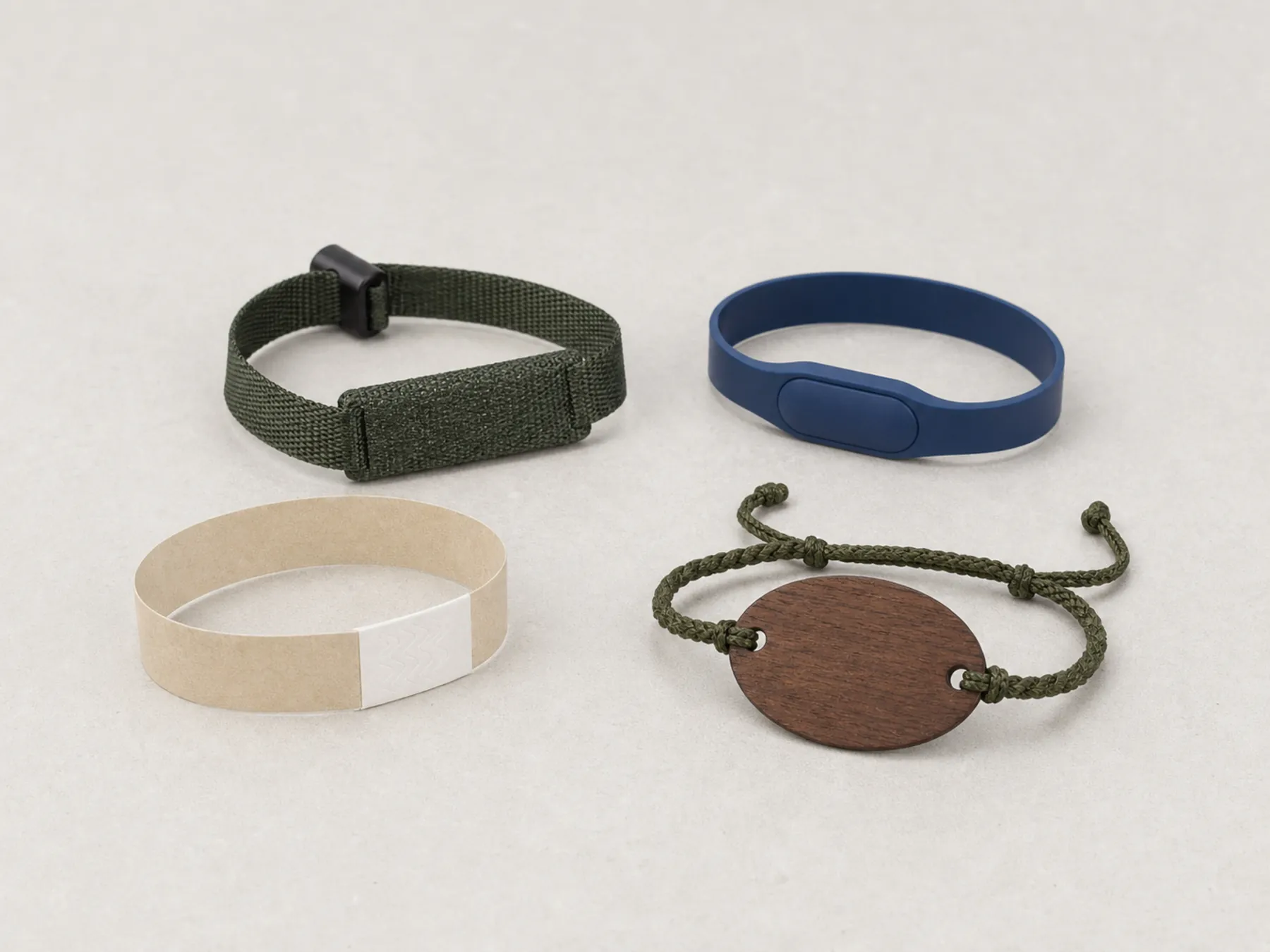
A logo that looks perfect on a flat proof can be illegible on a finished band, because the band curves, flexes, gets wet and collects sunscreen. Choosing a decoration method is choosing how the mark will age, not how it will look on approval day.
The four methods, and what each is actually for
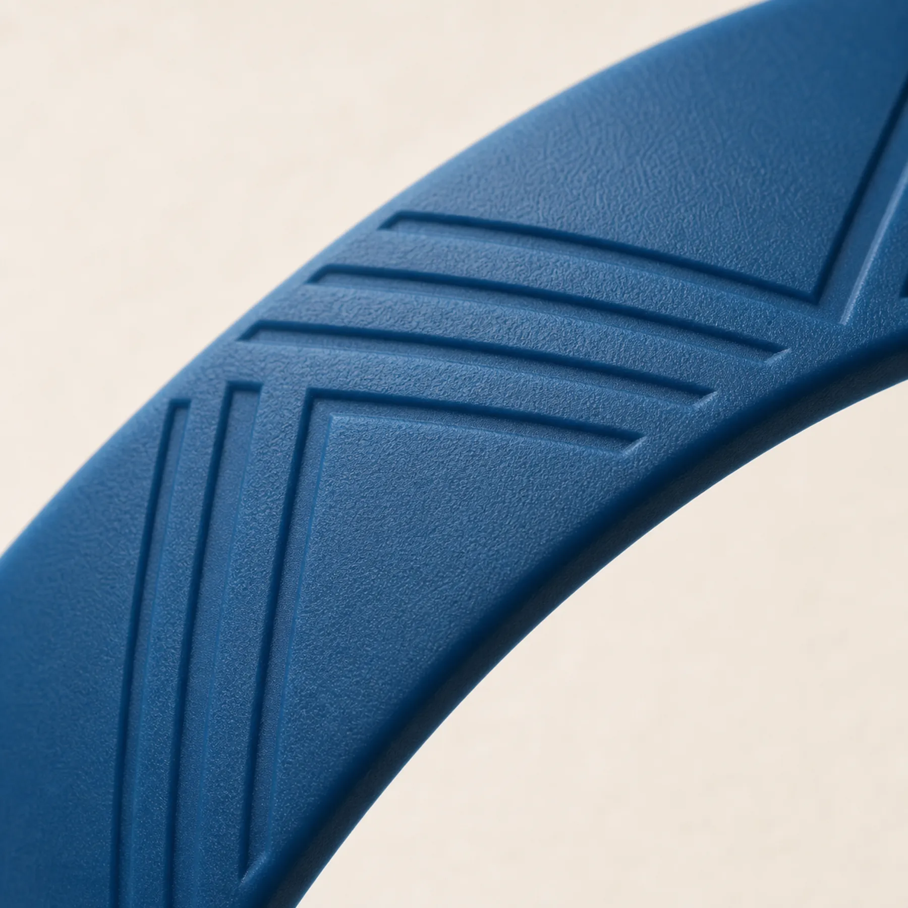
Printing puts a layer on the surface: the finest detail, the widest colour range, and the shortest life, because a printed layer wears where the band is handled and dulls where oils collect. Debossing presses the mark into the surface, so it is carried by geometry and survives almost anything; an infilled deboss adds colour into that recess.
Laser engraving removes material and exposes a darker layer beneath, which is the right method on wood and bamboo and the wrong one on silicone. Moulded-in colour builds the mark from two compounds during moulding and cannot wear off at all, at the cost of tooling and of being fixed for the run.
- Screen print
- Finest detail and widest colour. Sits on the surface; dulls with abrasion and sunscreen. Best for short-life and day credentials.
- Deboss
- Carried in the geometry, so it survives cleaning and wear. Limited to a single tone unless infilled.
- Deboss and infill
- A colour held in the recess rather than on the surface. The default for a band worn for a full stay.
- Laser engraving
- For wood, bamboo and other natural faces. Permanent, fine, and unavailable on silicone.
- Moulded colour
- Two compounds bonded in the tool. Cannot wear off; fixed at set-up and not changeable within a run.
Design for a surface that moves
A wristband is not a flat substrate. It curves in two directions, it flexes at the closure, and it is read at an angle by someone who is not concentrating. Hairlines, small reversed type, tight registration between two colours and delicate serifs all degrade under those conditions even when the printing is faultless.
The practical adjustment is to set type slightly heavier than a brand guideline suggests, simplify any mark with fine internal detail, and avoid placing anything critical within the flex zone beside the closure.
Approve on the production shape
A flat visual proof cannot show a logo sitting proud of a face radius, a mark falling into a closure shadow, or a colour reading differently on a curved surface than on paper. Those only appear on the object.
That is why artwork approval happens on a production-realistic sample rather than on a PDF. It adds a step and it removes the category of problem that is most expensive to discover after a run is made.
Colour behaviour is a specification, not a preference
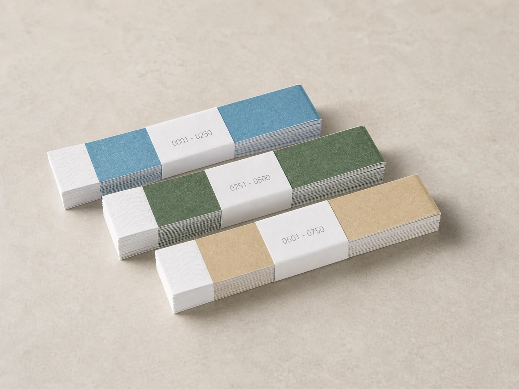
Wet silicone reads darker. Sustained sun shifts pale and fluorescent pigments first. A recycled yarn takes dye slightly differently between batches. None of those is a defect, and all of them matter if the colour is carrying meaning rather than just looking pleasant.
Where colour identifies a tier, a zone or a session, choose on hue contrast rather than tone, check the palette wet as well as dry, and hold a physical colour reference for reorders rather than a colour name.
One mark, several substrates
Most properties end up with the same identity across a moulded band, a woven band, a card and a wood face. Those four surfaces resolve detail differently, and forcing an identical treatment onto all of them makes the weakest one look like an error.
The pattern that works is a full mark where the surface supports it — the card, the engraved face — and a simplified device where it does not: the woven strap, the narrow band. It reads as a considered system rather than as an inconsistency.
If the credential is worn for a day, print it. If it is worn for a stay, deboss it. If the face is wood, engrave it. If the colour must never wear off, mould it.
Compatibility is confirmed against the property’s lock system, credential technology and encoding requirements before production. We do not claim universal compatibility.
What to send with an enquiry
Include the installed system model, an existing credential sample where possible, quantity, expected wear period, guest types, controlled zones and artwork direction. For material-led options, state the evidence or production documentation your procurement team expects.
FSC-certified material options available with supporting production documentation.
No named hotel or customer project is used as proof. The reasoning behind that stance is set out on the about page.