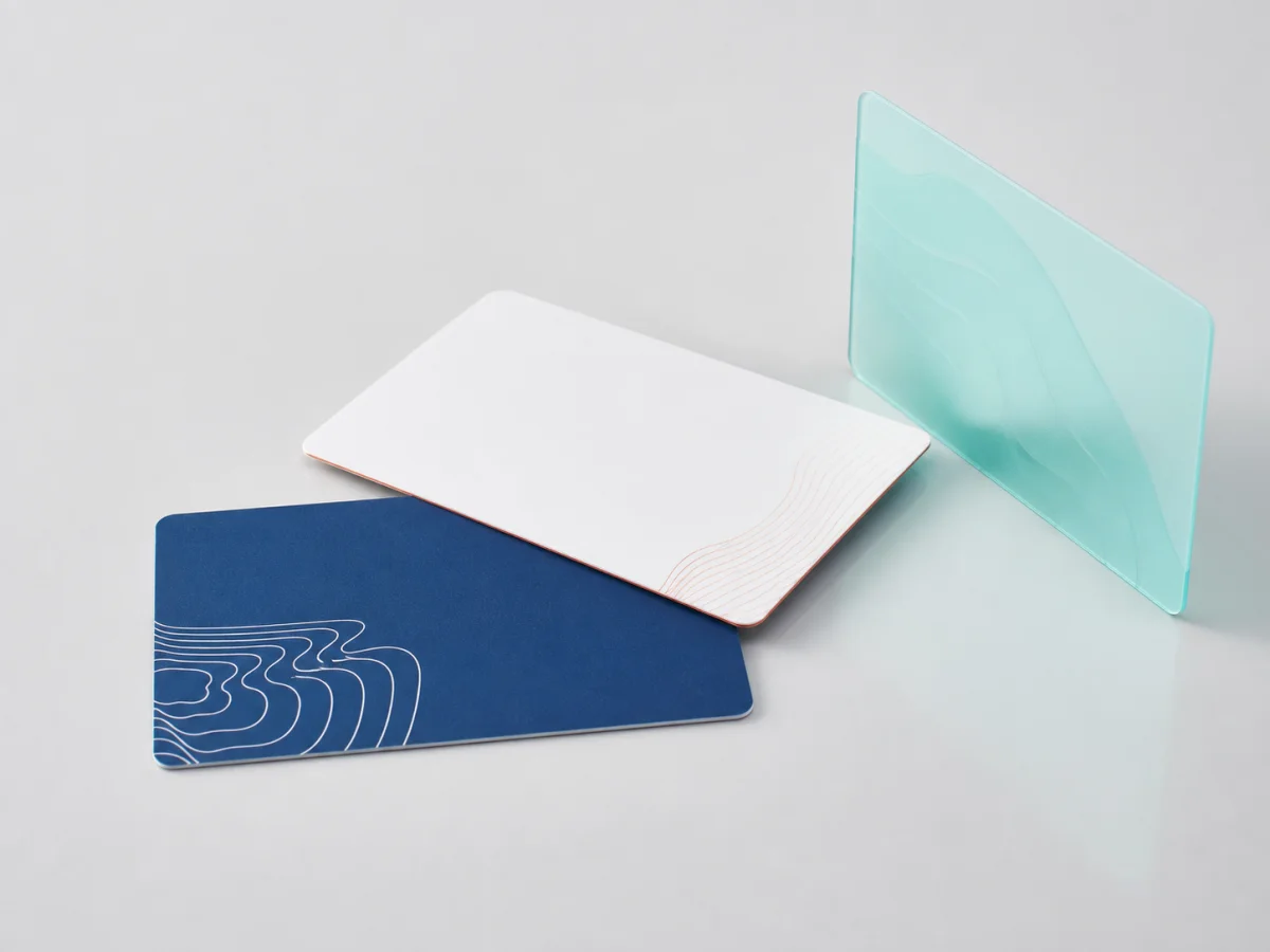
Production is measured from artwork approval, so every round of artwork correction is a delay to the delivery date. Almost all of those rounds are avoidable.
- What to send
- Design for the surface, not for the file
- Bleed, safety and the things that move
- Colour, stated as a reference
- Approval is on the object
What to send
Vector artwork with fonts converted to outlines, or the fonts supplied. A stated colour reference rather than a screen value. A note on which mark is authoritative where a brand has several. And the credential the artwork is intended for, because the same mark is prepared differently for a card and for a narrow band.
Sending a presentation slide, a screenshot or a low-resolution image is the most common cause of a first-round delay, and it is entirely avoidable.
The checklist that removes most delays:
- Vector files with fonts outlined or supplied
- A physical or standard colour reference, not a screen value
- The authoritative version of the mark, where several exist
- Which credential and which surface the artwork is for
- Any text that must be legally exact — operator names, notices, numbering formats
Design for the surface, not for the file
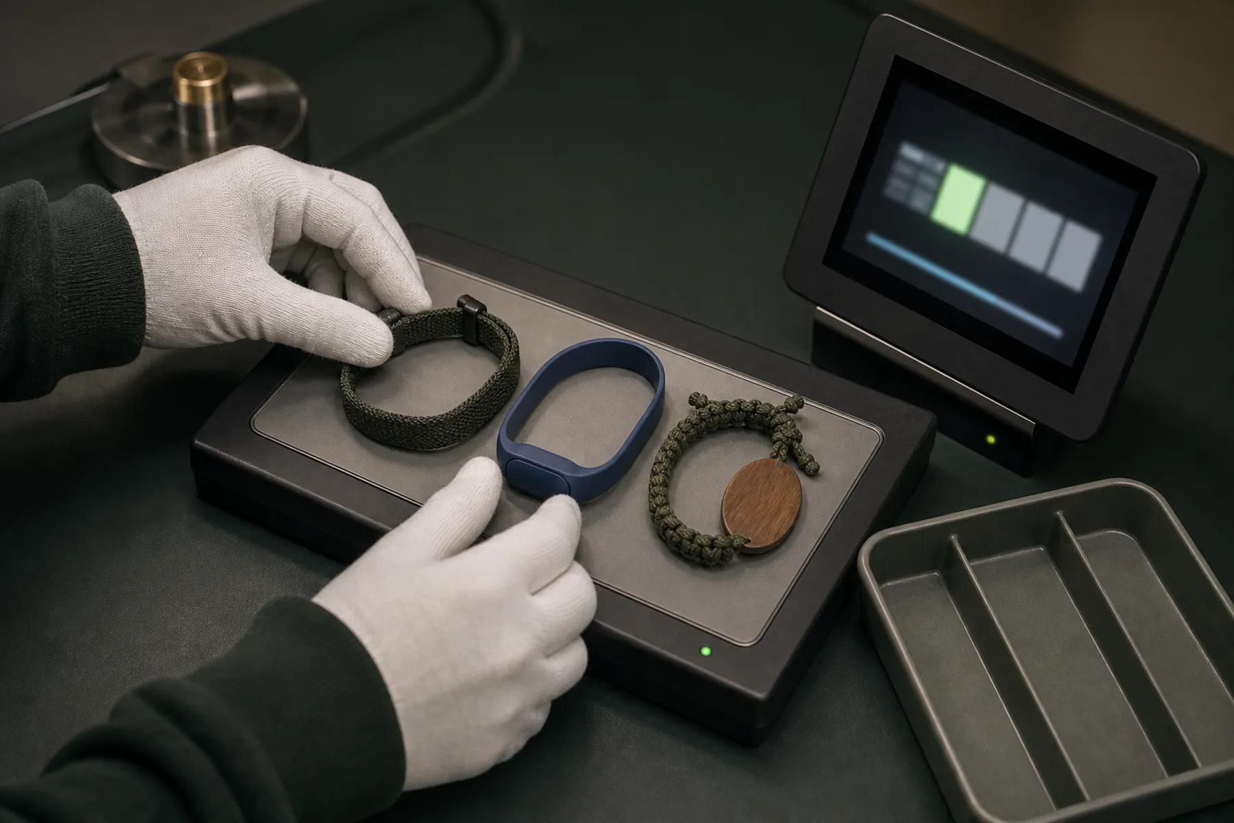
A card is flat and forgiving. A wristband curves in two directions, flexes at the closure and rotates on the wrist. Artwork that ignores that produces a mark cut in half by a closure, a logo distorted over a face radius, or a wordmark that spends most of its life on the underside of a wrist.
The practical adjustments are simple: keep critical elements out of the flex zone, set type slightly heavier than a guideline suggests, and use a repeated device rather than a single logo on anything that rotates.
Bleed, safety and the things that move
Production tolerances mean nothing sits exactly where a file says it will. Anything critical needs to be inside a safe margin rather than tight to an edge, and anything intended to run off the edge needs bleed.
On moulded products there is an additional consideration: the closure holes, the module face and the parting line are physical features the artwork has to work around rather than over.
Colour, stated as a reference
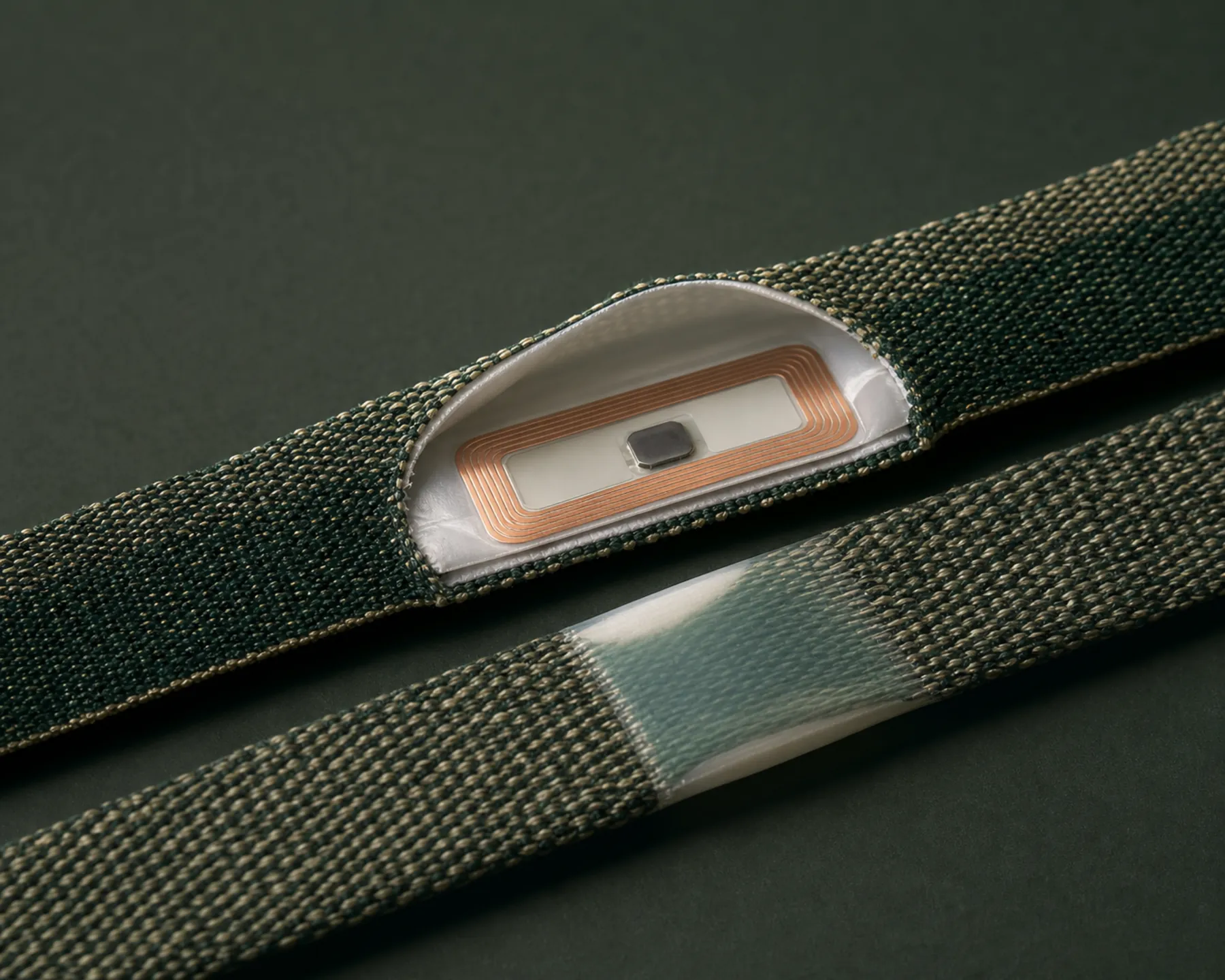
A colour name drifts between runs; a stated standard reference does not. For natural materials and recycled yarns, approve colour on a physical sample from production material rather than on a digital proof, and hold that sample as the reorder standard.
Where colour carries meaning — tiers, sessions, height categories — check the palette wet as well as dry, because wet material reads darker and can collapse the difference between two similar tones.
Approval is on the object
The final approval step is a production-realistic sample, not a PDF. That is where a mark proud of a radius, a colour reading differently on a curve, or a zone letter falling into a closure shadow becomes visible.
Once approved, the artwork revision is recorded with the sample, colour reference and credential input as one reorder reference. A later run is checked against that rather than against the file somebody has on their desktop.
Production is 14–21 days after artwork approval. Every correction round happens before that clock starts, which is why artwork preparation is where delivery dates are won or lost.
Compatibility is confirmed against the property’s lock system, credential technology and encoding requirements before production. We do not claim universal compatibility.
Questions this raises
01What file format do you need?+
Vector artwork with fonts outlined or supplied. A presentation slide, a screenshot or a low-resolution image is the most common cause of a first-round delay, and converting one is slower than sending the original.
02Can we approve artwork from a PDF?+
For a first review, yes. Final approval happens on a production-realistic sample, because a flat proof cannot show a mark sitting proud of a face radius, a colour on a curve, or a detail falling into a closure shadow.
03How do we keep colour consistent between orders?+
Approve on a physical sample from production material and hold it as the reorder standard, especially for natural materials and recycled yarns where dye uptake moves between batches. A colour name is not a reference.