
What two-tone actually buys a property
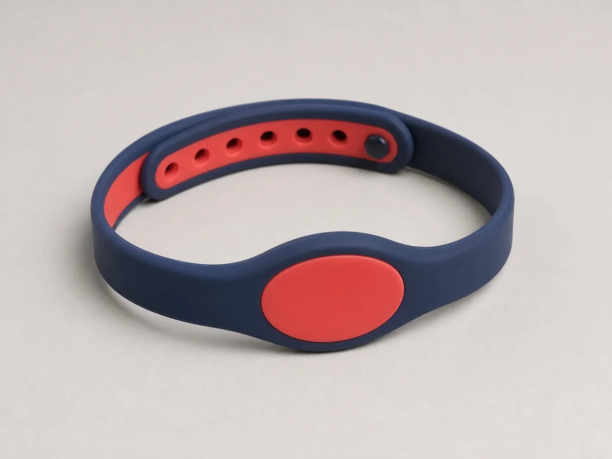
The argument for it is operational, not decorative. A member of staff at a beach bar cannot read a printed tier code from three metres away, but they can read a colour block. A moulded colour split gives that at any angle, in bright sun, on a wet band, for the whole stay — which is the set of conditions where a printed tier marker is least reliable.
It also removes a category of front-desk error. When the tier is the band you pick up, rather than something you write or print onto a band, staff cannot issue the wrong tier by selecting the wrong template. The stock itself enforces the distinction.
How the two compounds are joined
The colours are moulded in sequence and bond at the interface rather than being glued. That bond is the part worth understanding: it is strong in shear but it is a discontinuity, and a design that puts the colour boundary exactly at the point of maximum flex — the fold beside the closure — is asking the band to work its weakest line every time it is opened.
We place the boundary away from the flex zone as a matter of course, usually at the edge of the module face. If the property’s design demands a mid-strap split, we sample it and flex it before approval rather than reasoning about it.
Choosing colours that stay distinguishable
Tier colours have to survive two things: sunlight over the season, and being wet. Wet silicone reads darker, which quietly collapses the distance between a mid-blue and a navy at exactly the moment staff need to tell them apart. We test the pairs wet as well as dry before approving.
Pale and fluorescent tones shift most under sustained sun, so a tier system built on pastel differences degrades fastest. Systems built on a strong hue contrast — a light strap against a dark face, or two clearly separated hues — stay readable to the end of the season, and to staff with colour vision deficiency, which is a real consideration in a large team.
Questions we ask before locking a tier palette:
- How far away does a member of staff need to read the tier?
- Do any two tiers have to be told apart by someone with colour vision deficiency?
- Does the palette still separate when the band is wet and the guest is in shade?
- Will a new tier be added mid-season, and where would its colour come from?
The planning constraint nobody expects
Each colour pair is a tool set-up. That makes tiers less fluid than a printed system: adding a fifth tier in August is a new production run, not a new print file. Properties that expect their tier structure to change should either agree the full palette at the first order, or keep one tier printed rather than moulded so it can flex.
Because each pair is its own run, the minimum applies per pair. Five tiers is five counts of 500 rather than 500 split five ways, which is the single most common surprise on a two-tone specification and the reason we map the tier structure before quoting anything.
Minimum order is 500 pieces per artwork, with 14–21 days production after artwork approval. On a two-tone range each colour pair counts separately, so the tier map has to be settled before the order is placed rather than after.
Where the credential fits into a visual tier system
The colour carries the tier for people; the credential carries it for the system. Those two should agree, and keeping them in step is a data question rather than a product one — the encoding, the numbering range and the colour have to be issued together, or a guest ends up wearing a colour that says one thing while the reader says another.
We supply each colour pair in counted, range-labelled blocks so a property can tie a numbering range to a tier at the point of goods-in. That is what makes the visual system auditable later.
When this is the wrong model
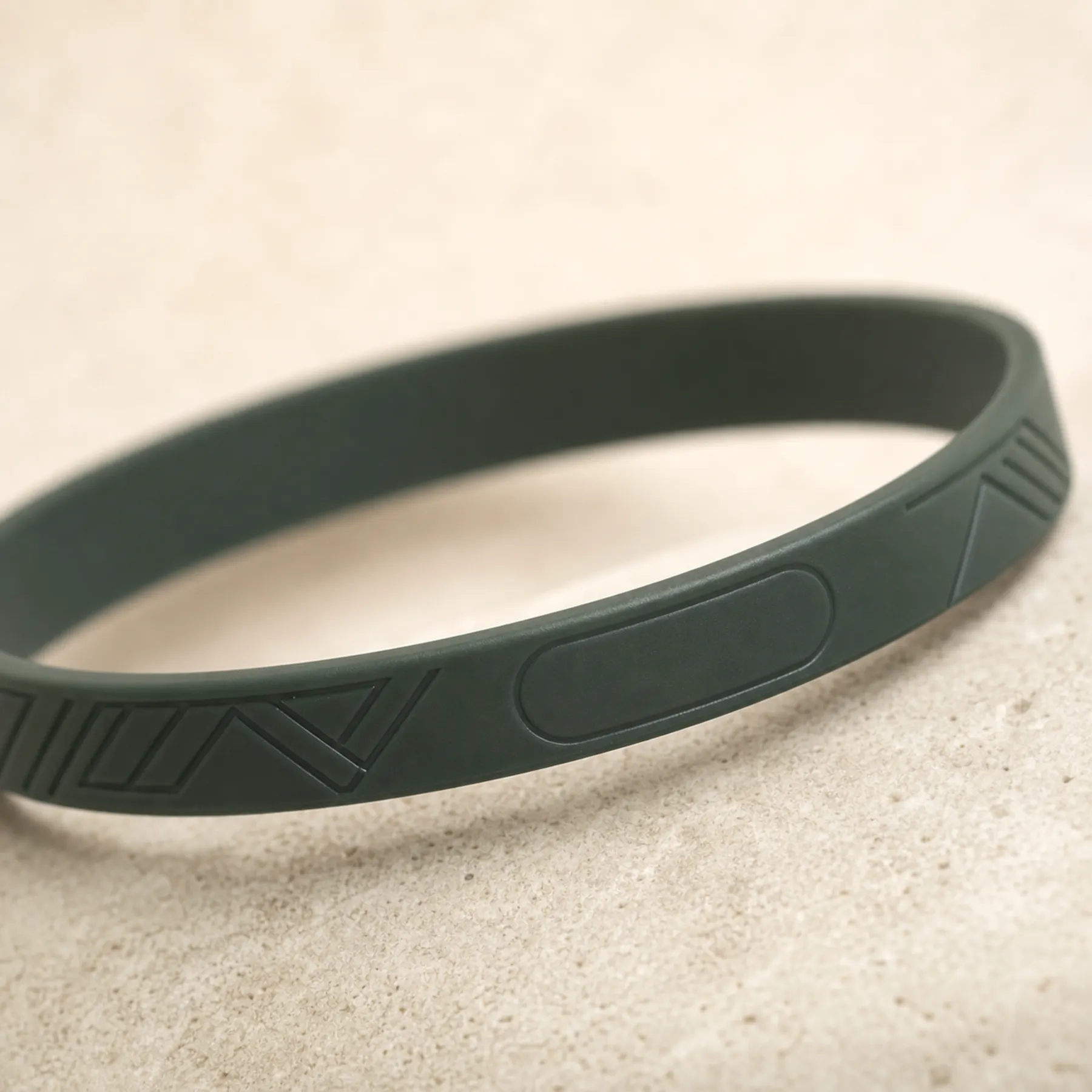
It is wrong for a property with a single guest type, where the second colour is doing no work and a single-colour band with a debossed mark is cleaner and simpler to reorder.
It is also wrong where tiers change frequently or are decided per event. Printed or day-credential formats absorb that kind of change; a moulded colour split does not.